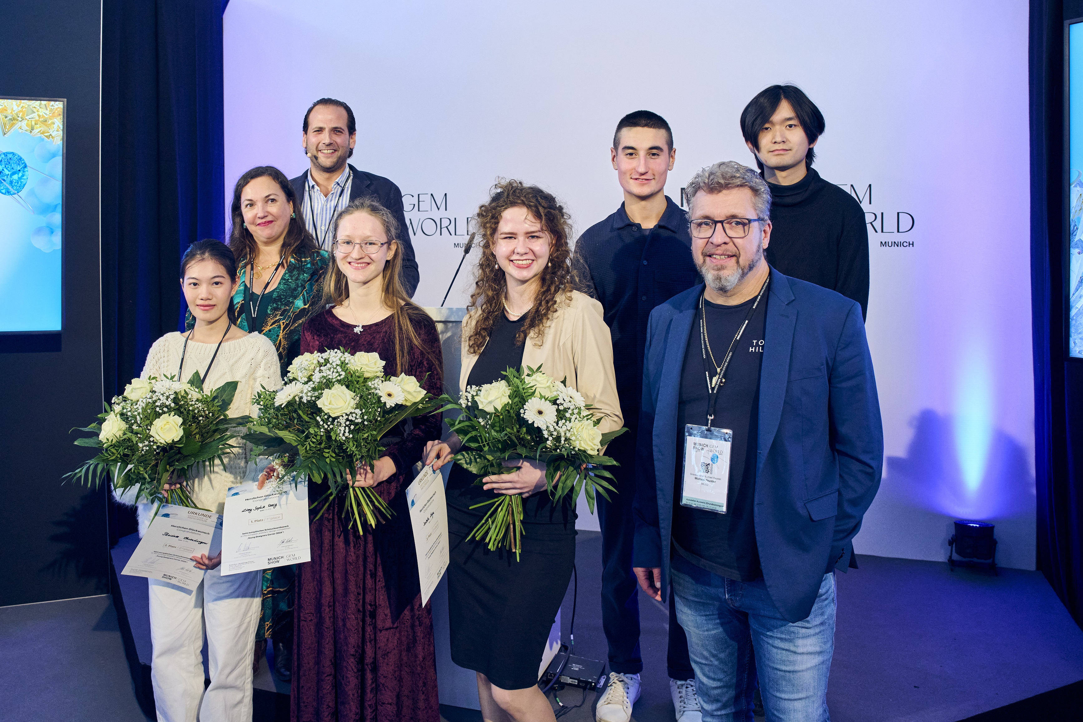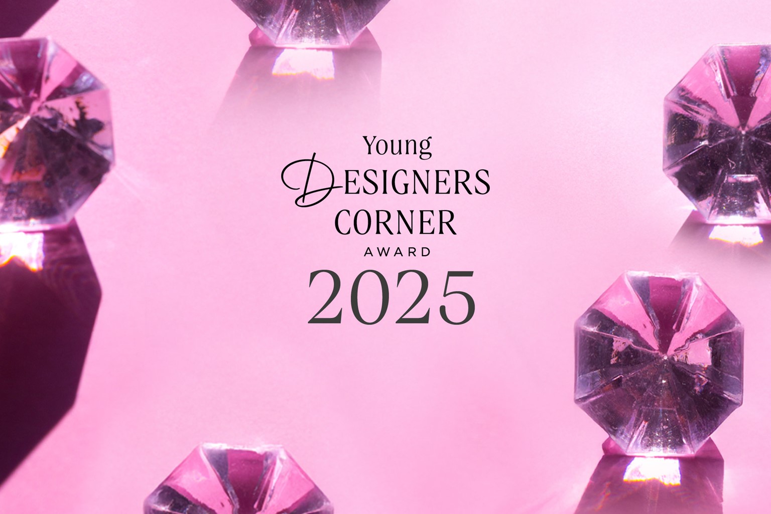
The finalists of the Young Designers Corner 2025
Sept 26, 2025
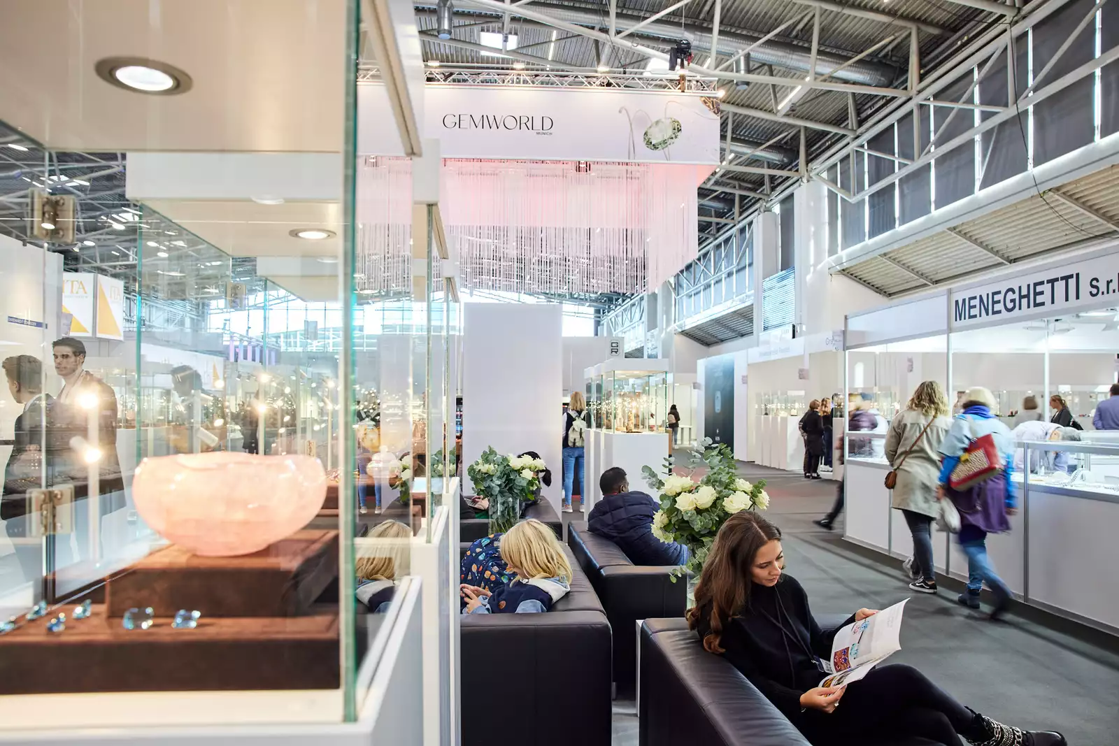
The time has come – the finalists of the Young Designers Corner Jewelry Competition 2025 have been determined! From numerous entries, the jury has selected five young up-and-coming designers who will be invited to present their work at Gemworld Munich from
October 23 to 26, 2025.
In addition to the prizes awarded by the jury, there will also be a public vote via the Instagram account of the Munich Show in the run-up to the fair.
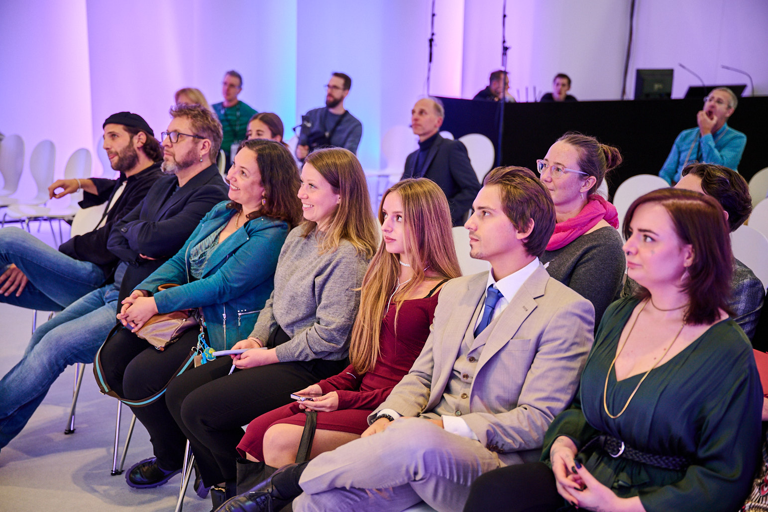
Award ceremony of the “Young Designers Corner” 2025:
Thursday, 23.10.2025 | 4:00 p.m. | Forum in Hall B6
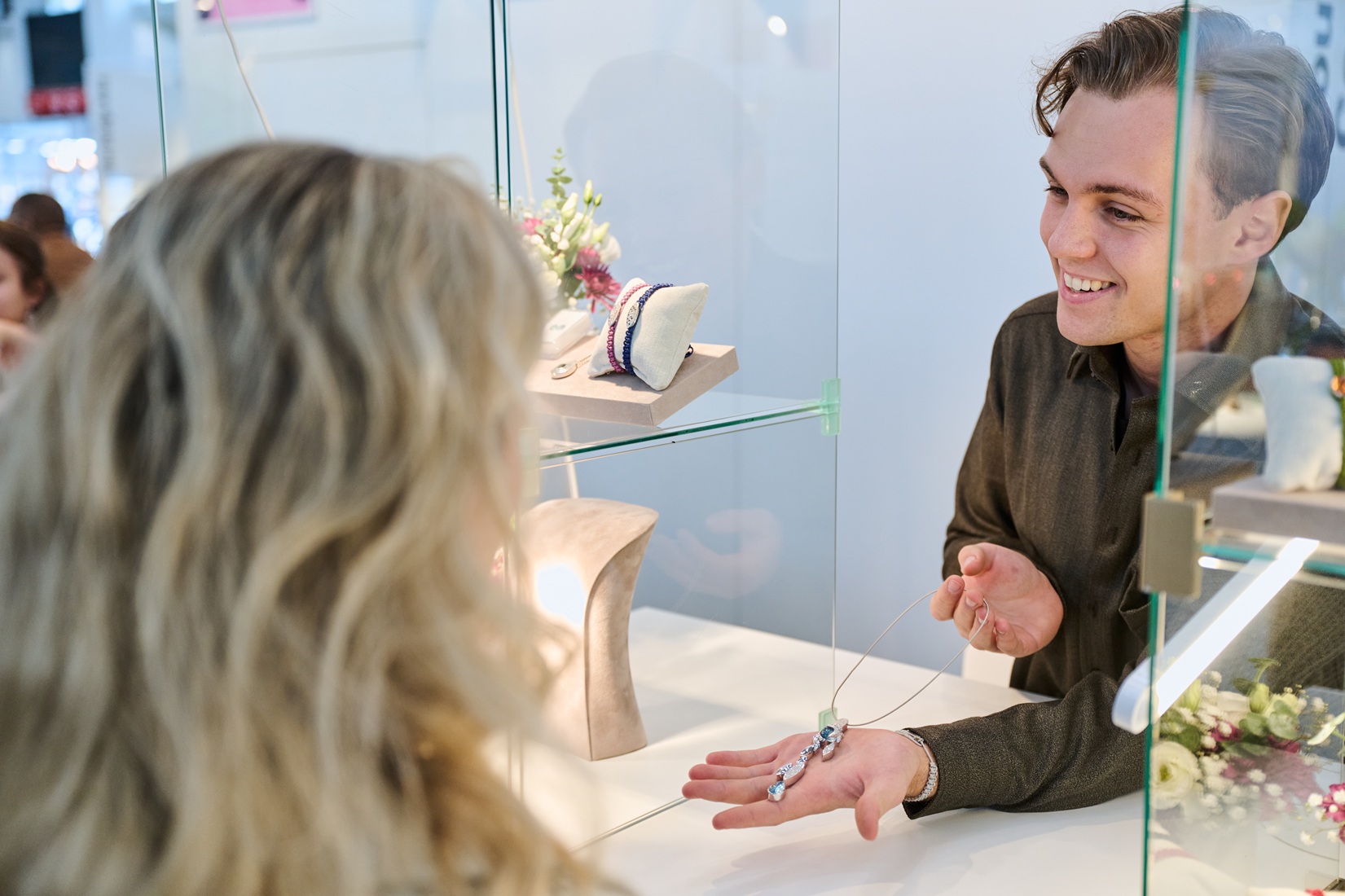
A top-class jury of experts
Interesting prices
International audience
The Young Designers Corner Award
Since 2012, the Munich Show - Mineralientage München has been presenting the “Young Designers Corner” award - a prize for young talents from the jewelry industry. The competition offers dedicated creatives the opportunity to present themselves on an international stage and demonstrate their skills. A top-class jury of experts selects the eight finalists. The criteria for judging the jewelry and watches: Innovation, suitability for everyday use and technical/artistic realization.
Learn moreWinners 2025:
1. Place: Marcel Gebert
2. Place: Antonia Simon
3. Place: Valeria Fernandez-Restrepo
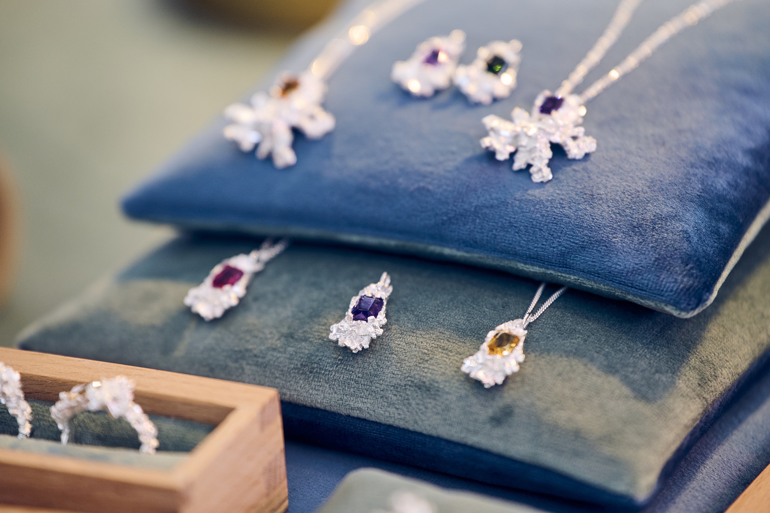
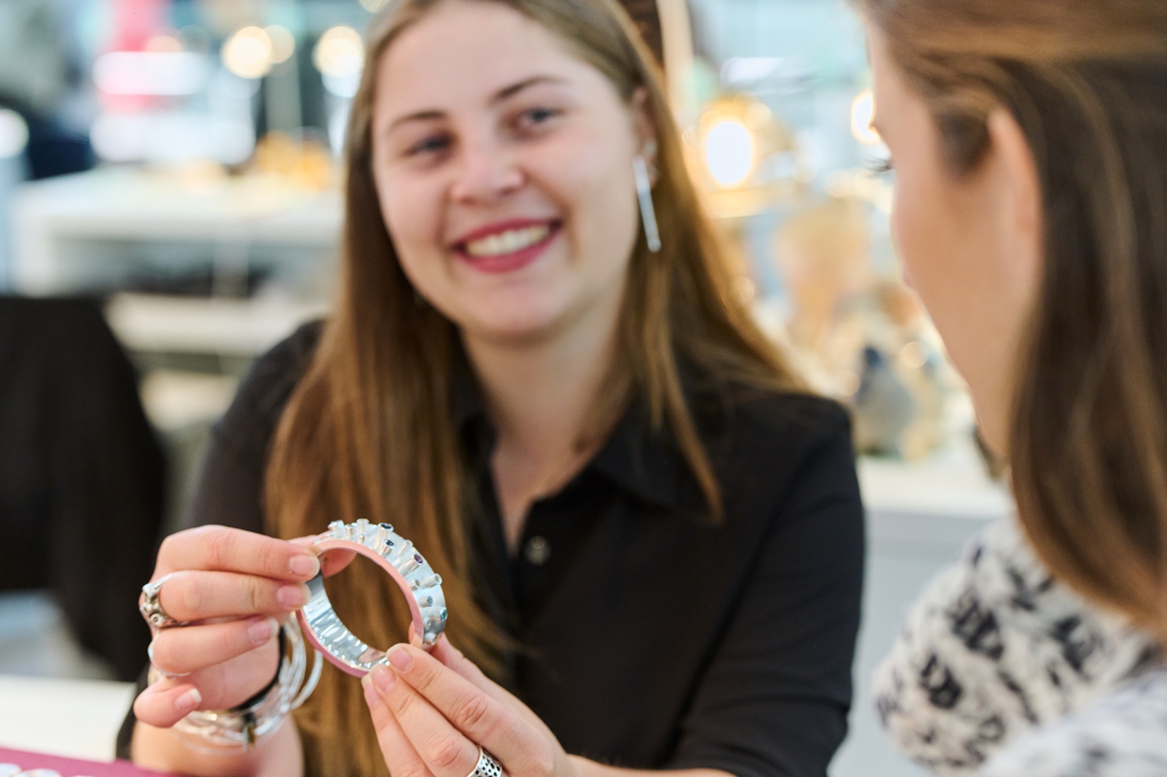
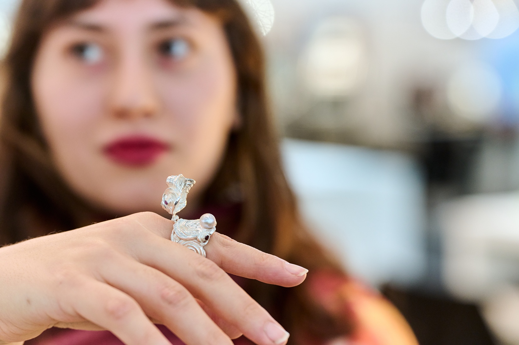
The jewelry concepts of this year's finalists in the Young Designers Corner:
Anna Kalawrytinos (Germany)
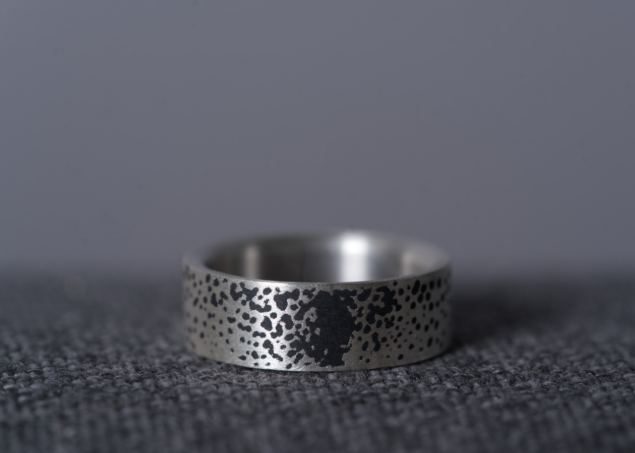
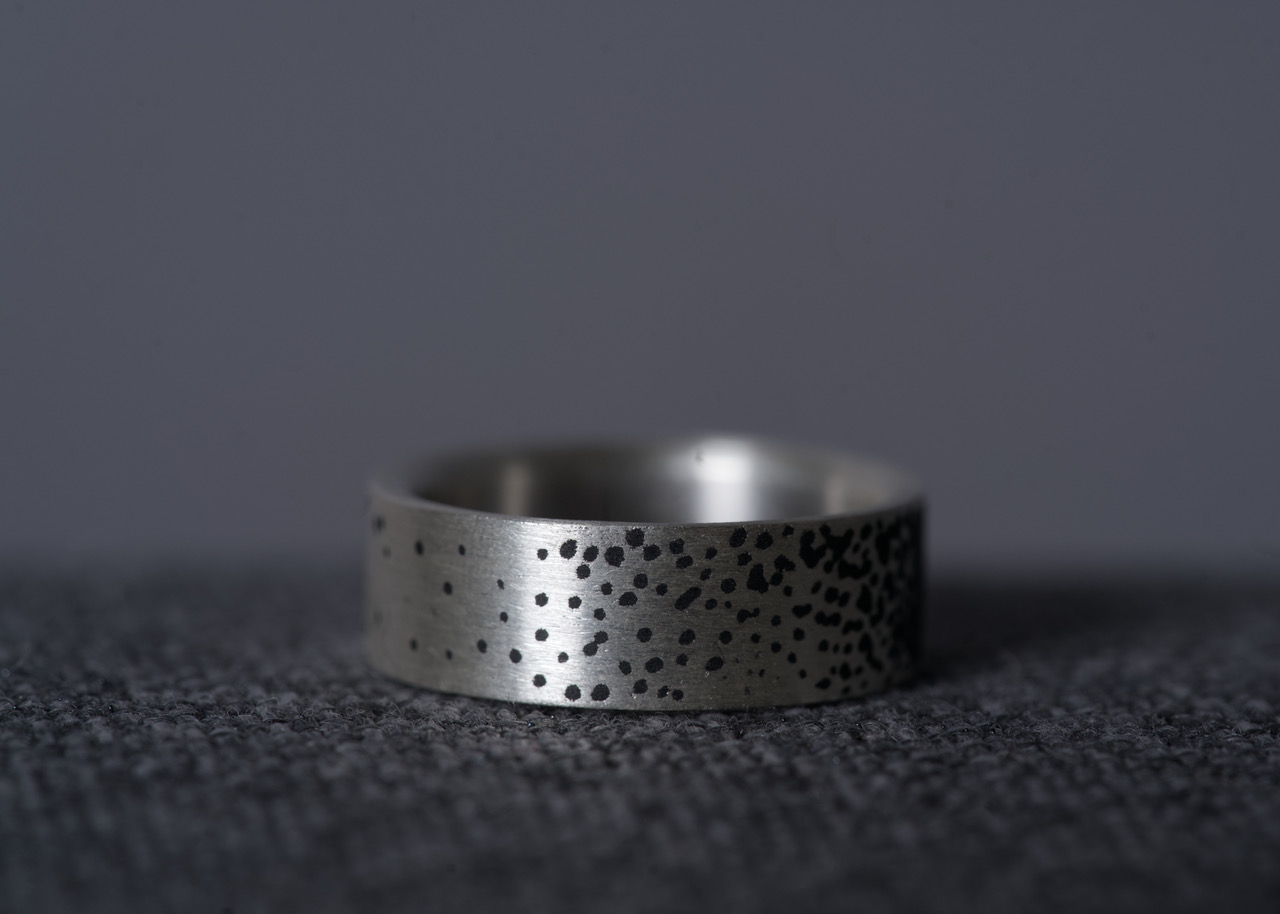
Silver is one of the easiest precious metals to work with and has been used and processed by goldsmiths for thousands of years. Silver also contrasts strongly with the dark gray color of the ceramic.
More
The ceramic I use for the ring was originally developed for use in space technology.
It is lightweight, heat-resistant, and very durable. In combination with silver, it protects it from scratches and makes the ring robust and suitable for everyday use.
In industry, aluminum oxide/titanium dioxide is considered to be very wear-resistant and resistant
to chemical influences.
For the motif, I explored the shape of the circle. The ring directly reflects this shape, and the chosen pattern also picks up on this theme. The circle
symbolizes perfection, eternity, and harmony. It also stands for the reconciliation of opposites.
I started the design process with quick sketches. In doing so, I tried to
visually represent and capture various opposites using simple graphic means.
The contrast between light and dark in particular came to the fore once again, confirming itself as a central theme. Against the backdrop of the current global political situation, the motif seemed particularly relevant to me, which is why I decided to explore it further.
For me, it is essential that communication takes place, especially in times of crisis. Without
open exchange, there is no way to achieve a rapprochement between opposing sides and points of view. In my design, I try to make this idea of reconciliation visible in a point shading. Black and white blend into flowing transitions in different shades of gray, symbolizing compromise and understanding. No section of the ring repeats exactly the same pattern, emphasizing the diversity and dynamism of communication. Each section tells its own story while reflecting the larger whole.
I drew and soldered the profile of the ring. The pattern is then carved into the material using a
ball end mill. The ring is sandblasted for the ceramic coating. The coating is applied at 8000° C and the powder is applied to the silver at twice the speed of sound. Finally, the ring is sanded by hand until the silver is visible and the ceramic is only visible in the recesses.
Antonia Simon (Germany)
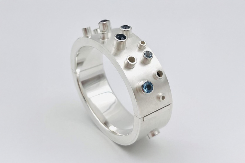
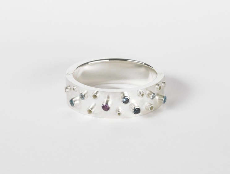
The bangle is inspired by the shapes found in the sea – in particular, the octopus and its suction cups. The octopus symbolizes changeability, skill, and strength. Its tentacles with suction cups are stylized in the bangle and echoed in the settings and gemstones. The piece thus combines the idea of nature with the clear precision of goldsmithing.
The selection of gemstones – topaz, amethyst, and spinel – adds colorful accents in shades of blue and violet. These colors are reminiscent of the depths of the ocean and reinforce the maritime reference.
More
Design
• Shape: The bangle is hollow and has an oval shape that fits ergonomically around the wrist.
• Structure: The rhythmically placed settings (tubes) protrude from the surface like small suction cups, giving the bangle a lively appearance.
• Stones: The seven gemstones are deliberately asymmetrical but distributed in a harmonious balance to enhance the impression of natural movement.
• Contrast: The cool elegance of the 925 silver is broken up by the bright colors of the gemstones.
Craftsmanship
• Inner and outer band: Precise bending, straightening, and soldering to create a stable basic shape.
• Bezels and tubes: Neatly fitted, soldered, and arranged at different heights to create depth and rhythm.
• Hinge & lock: Precision work with a counter hinge and box lock, representing an invisible, secure, and technically sophisticated locking mechanism.
• Setting & surface treatment: Fine setting work with polished edges, careful polishing on the inside, and a matt finish on the outside for an exciting finish.
This piece is a bangle that combines the precision craftsmanship of goldsmithing with the inspirational power of nature. It is not only a technical masterpiece with its hinge and lock, but also a poetic object that translates the magic of the underwater world into a wearable piece of jewelry.
Marcel Gebert (Germany)
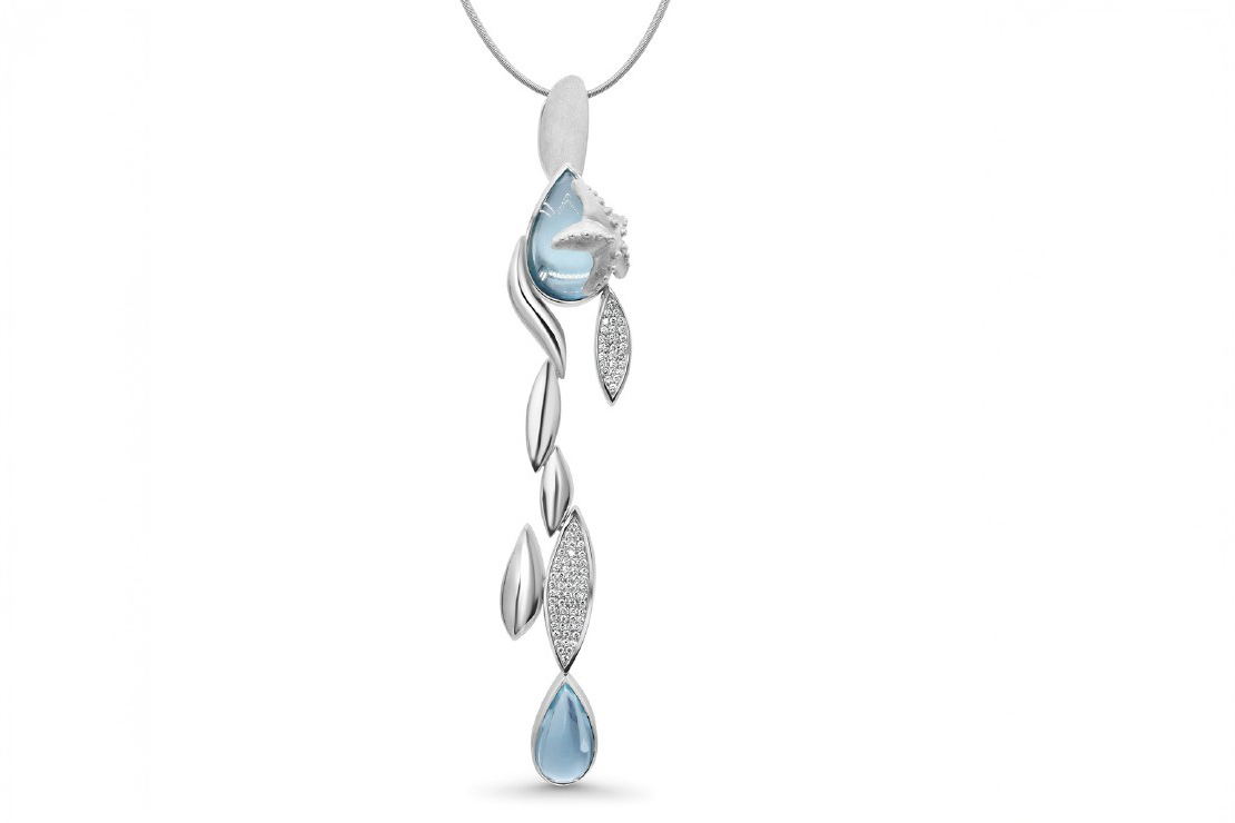
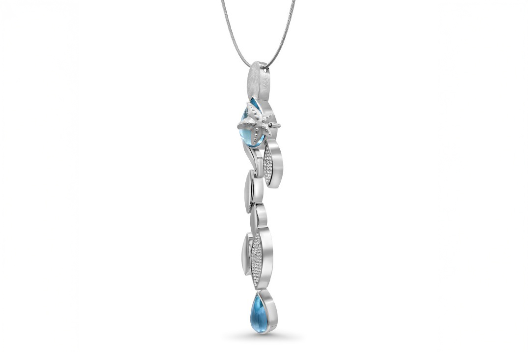
“Spirit of the Ocean” is a piece of jewelry that symbolizes the diversity of the sea. The calm, the movement, and the endless blue.
Inspired by my travels to Ibiza, it reflects the constant beating of the waves, which are never the same and always in motion.
More
The design follows the rhythm of the waves. Curved silver pieces rise and fall like waves rolling onto the shore at different heights. The unusually shaped eyelet blends smoothly into the design and symbolizes the soul, which is invisible in the sea but always connected to us.
Two smoothly cut drop-shaped aquamarines symbolize water droplets with their colorful and luminous shapes and cuts. The blue tone of the gemstones is reminiscent of the freshness and purity of the sea. A starfish created from wax rests above one of the aquamarines. It stands for life in the sea, for diversity and constancy in the marine world.
83 brilliant-cut diamonds give the piece a delicate sparkle. They are set in pavé surfaces and reflect the light like sunbeams dancing on the water's surface.
The two lower elements of the pendant are movable. With each swing, they reinforce the impression of dynamism and remind us that the flow of the sea lives on in jewelry too.
The subtitle “The sea is only blue” describes not only a color, but also an attitude: blue is not simply blue, but a spectrum full of nuances. Light, dark, clear, deep. Just as the sea reveals its infinite facets, this piece of jewelry also reveals a diversity that goes far beyond its materials.
Valeria Fernandez-Restrepo (Germany)
The idea for my ring Treasured Calm came about as a result of my wish to try out modelling techniques from disciplines other than jewellery, seeing how I could apply the optics, working patterns, and advantages of a technique to a piece.
The technique I focused on was coil building, which I have used often in my work with ceramics. As a material I chose to work with modelling wax to make my model, a material which like clay, is malleable, this allowed me to apply the same basic process which I use when coil building in ceramics to coil build my ring. By doing so, the process of making the piece had the same meditative qualities as coil building a pot, slowly and carefully, letting the coils guide the form. In doing so, I hoped to create a piece which would also allow the wearer to experience the same sense of soothing calm brought by the aforementioned meditative nature of coil building.
I started the piece without a clear picture of how I wanted the ring to look, and gave myself a set of rules as a way to begin giving form to the piece, limiting the choice of stones I wanted to use and the way I wanted to incorporate them into the ring.
More
The Rules
The stones had to be round and of a small size, 2-3 mm. They had to be placed at the very center of the coiled form. Each coiled form could only have one stone. The finished form should flow well together. The form should be made in such a way that the finished piece is wearable and functional.
The Piece
Using these limits I began to fi gure out the form for the piece. I wanted to take advantage of some qualities of coil building, specifi cally in the possibilities of creating hollow objects and organic forms. To do this, I decided to treat the gemstones as the middle point and coil cupular shapes, which quickly achieved volume while remaining light. One stone was coiled, and then another, and then the forms were puzzled together to form a hollow shape. The form of this shape, which occurred naturally while fi tting the different forms together, reminded me immediately of an oyster shell, which prompted the idea of somehow incorporating pearls into the piece. This quickly turned into the idea for a hinged ring, with a pearl in the middle, protected and providing the wearer with a hidden pleasure, and thus the fi nal form of the ring was designed.
As stated in my rules, I wanted to create a piece which would serve a certain function for the wearer, specifi cally the calming and soothing of the same. The hills and valleys of the piece, as well as the textured surface of the coils, which I deliberately chose not to blend into a smooth shape, can be used to trace soothing circles, and focusing on each individual stone should help the wearer lock into calm.
The wearability of the piece comes from the relative lightness of the ring, in spite of the larger shape, and the coiled yet comfortable band, wide but flat. Adding to the functional component is the hinged lid, which can be used to fidget and let out additional nerves but also protects the delicate surface of the pearl.
As of this moment I have finished the wax model and picked out the stones, the next step will be to cast the model in 925er Silver, add the hinge, set the stones, and add the pearl.
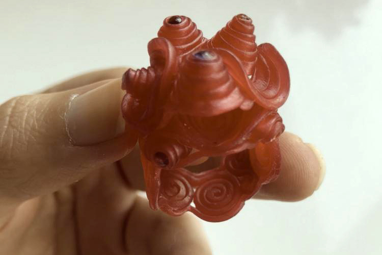
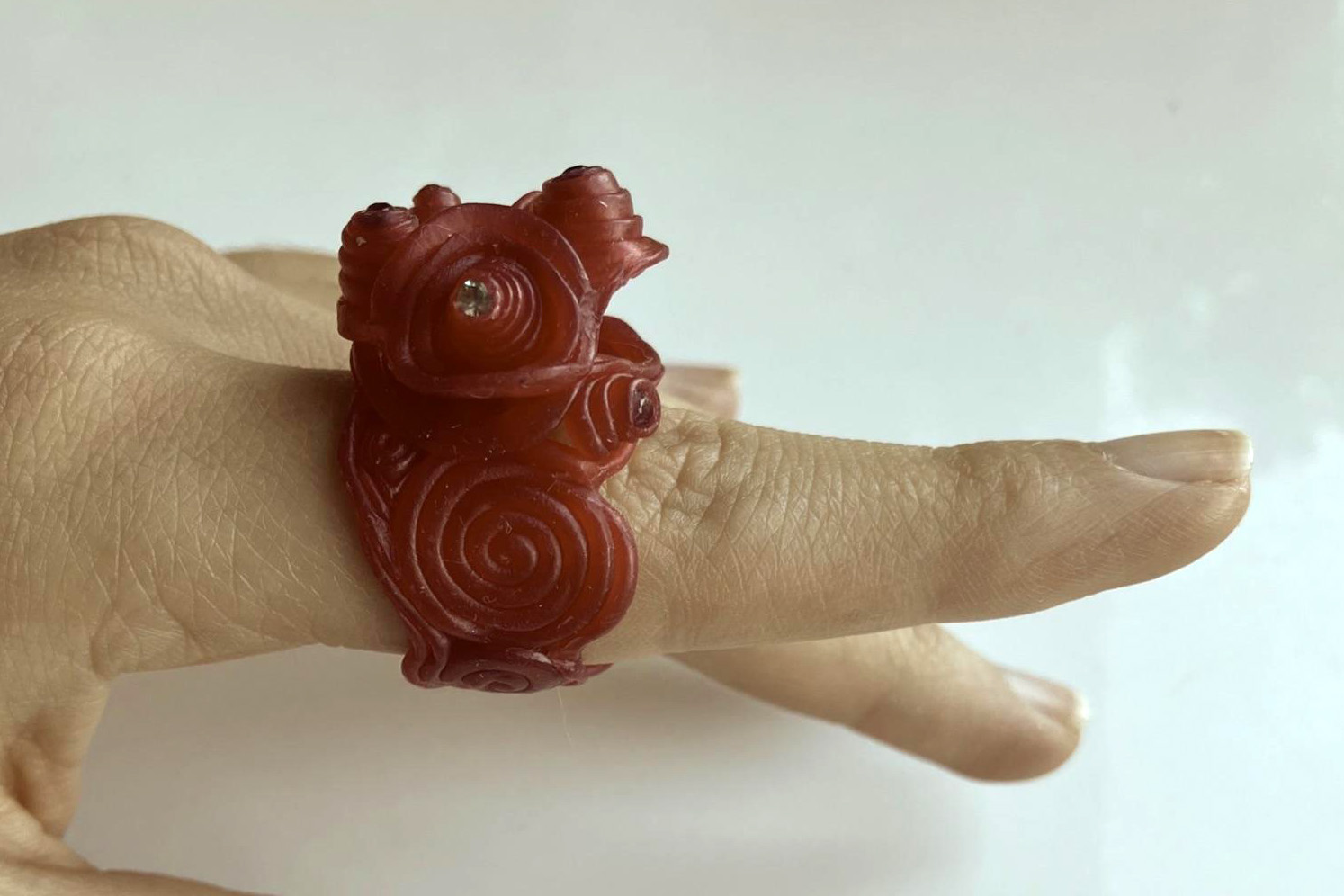
Patrick Scharf (Germany)
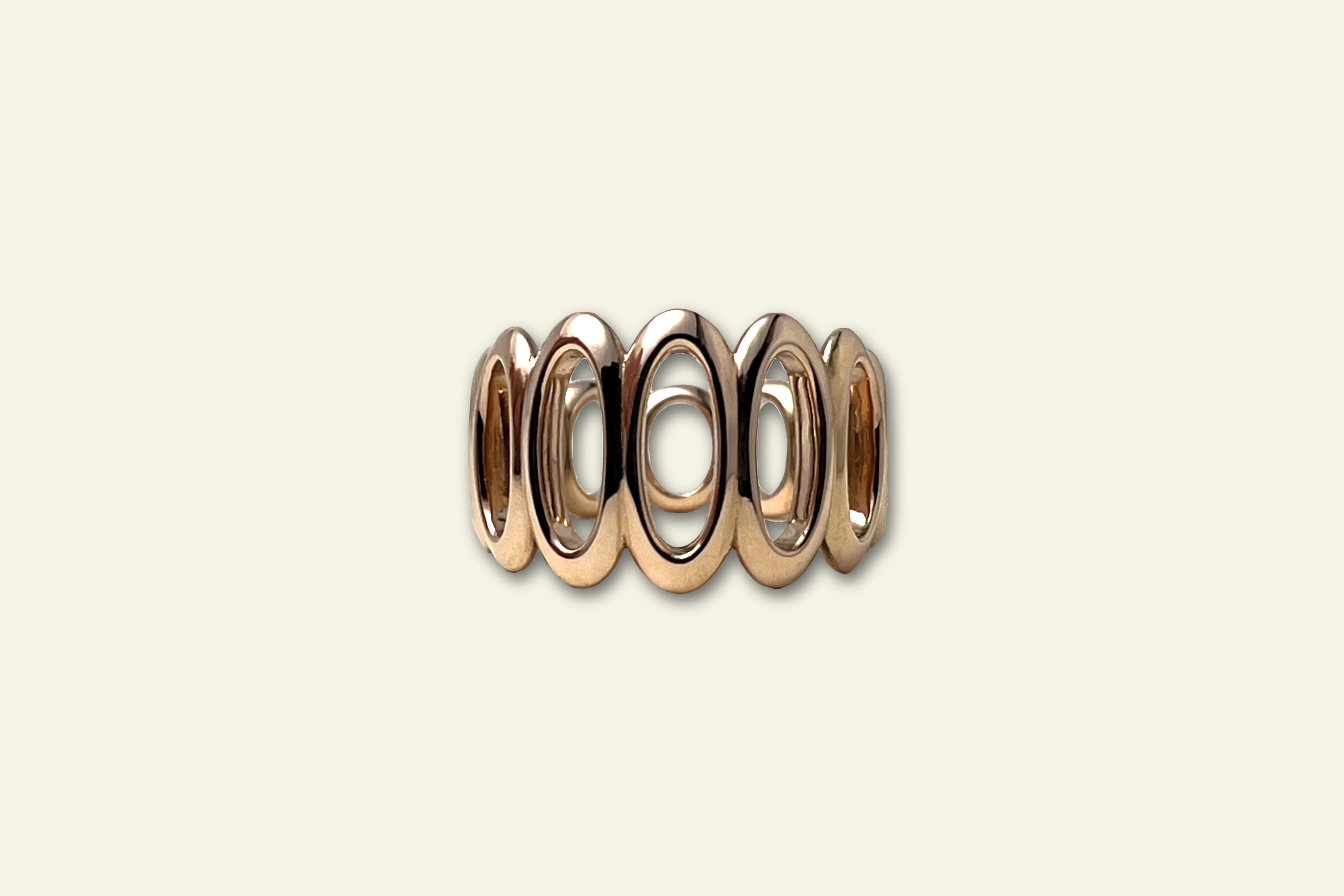
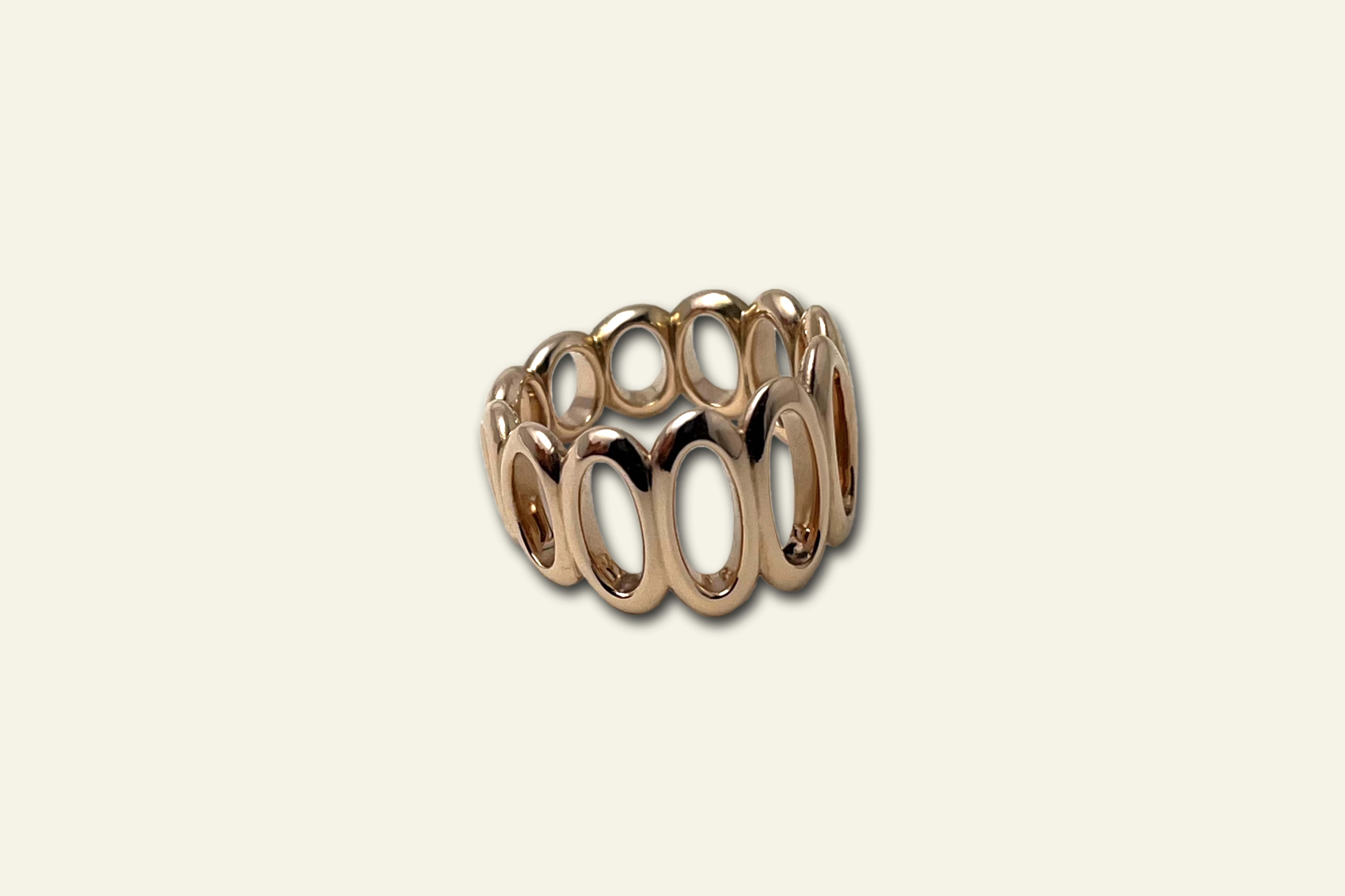
The basic idea behind the design of the piece of jewelry was not to use any stones. It is often said that jewelry design revolves around a stone, meaning that the stone comes first and the piece of jewelry is designed around it. The problem with this concept is that it sets certain parameters in advance, which often result in the piece of jewelry becoming merely a means to an end, namely to present or hold the stone in some way, so that the sum of the whole is no more than the individual parts.
More
Inspiration
The next step was to design the piece of jewelry, with coral serving as the inspiration.
In order to create a meaningful piece of jewelry, the question arises as to how this should be done. Coral often appears interesting because many species are shaped in such a way that cavities and negative spaces are created. This natural shaping creates sculptural structures that ultimately consist only of circles, ovals, or curves..
Realization
To create further conditions, it was decided that the piece of jewelry should be a ring, which presents the challenge of having to work in a smaller space compared to, for example, a brooch.
The next step was to create the piece of jewelry. This was done digitally using CAD software, in which several designs were drawn and later plotted.
The main design feature of the ring revolves around round shapes cut out on the inside to create a reference to the negative spaces of the corals.
In its basic form, the ring resembles a eternity ring, as the shape, in this case a type of eyelet, is repeated several times in the first variations. However, as this type of ring lacks almost any tension, a solution had to be found to create some. This can be achieved by interrupting the rhythm, incorporating a variation in the shape, an irregularity, or a break. The rhythm of the ring was not changed, as all elements were left the same width, but the eyelets were transformed into ovals or hollowed-out and compressed ellipsoids. The ellipses all have a “frame” of equal width and are conical in shape, so that on one side, the narrowest point, they almost form a circle again.
The shape of the ring appears both orderly and disorderly at the same time, because even when viewed from a point of symmetry, it is not immediately apparent whether this symmetry actually exists. In other words, the eye searches for more in a positive sense and is encouraged to look, yet the ring is not constructed in such a way that it appears unsettled or unbalanced in any way.
After determining the shape with the help of CAD and plots, the ring was cast in 750 red gold, finished, and polished. The decision regarding the material was purely subjective, but the polished surface was not; it was chosen to create reflections that blur the shape in a way and make the ring appear even more organic.
Tabaki Erofili (Greece)
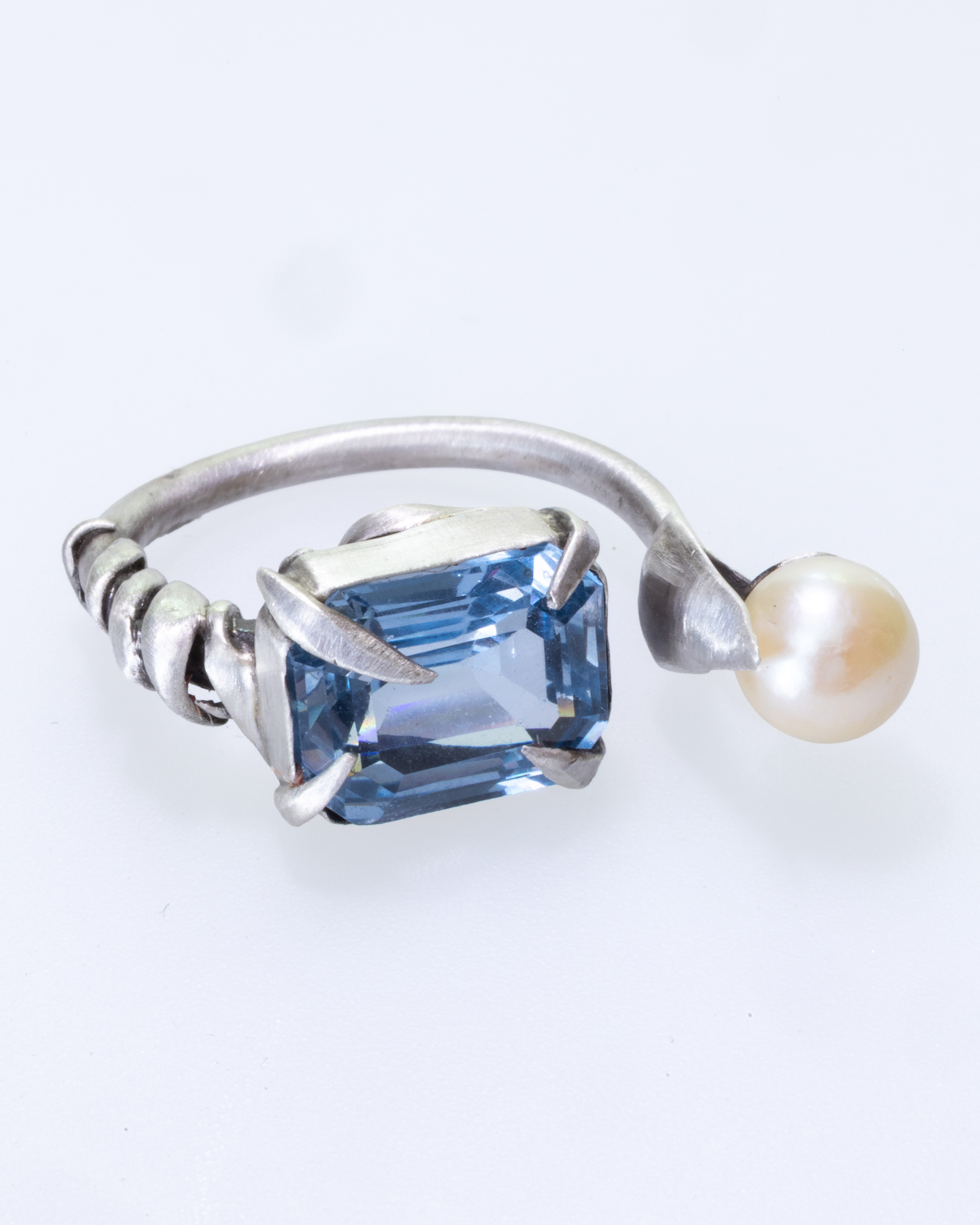
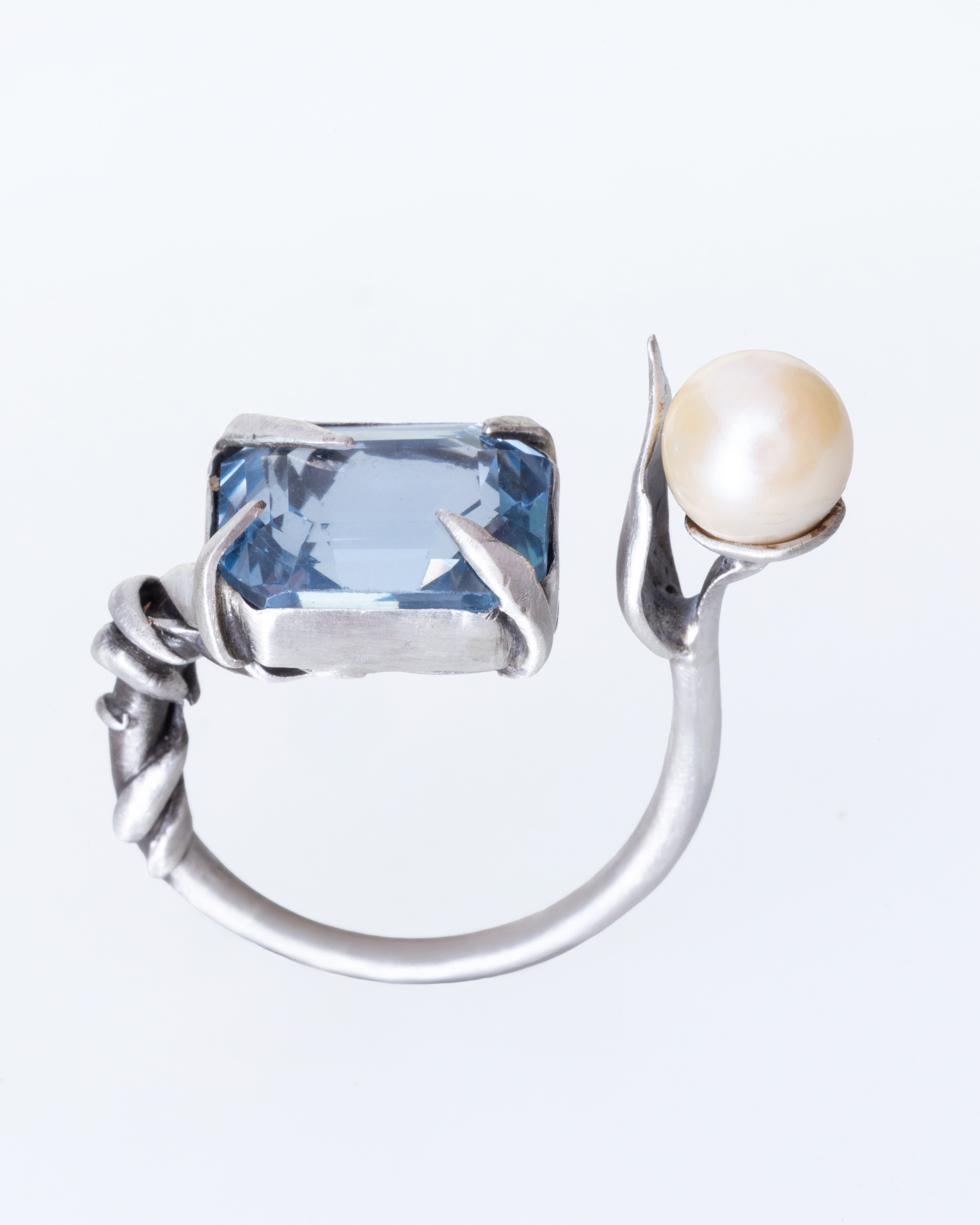
How can emotions transform into something visible?
Edgar Allan Poe had expressed that "the death of a beautiful woman is, unquestionably, the most poetical topic in the world". Since Poe himself remarked about his poem "The Sleeper" to be "in the higher qualities of poetry", this piece of jewelry accents for a humble ode to the "cursed" poet and the begone loves who engulf his literary work.
More
The poem's first verse, quoted on the front page, shapes the scenery where the mourning takes place. It is a June midnight and the moon beams its light all over the valley; and, while a lily playfully reflects its image on the lake's wavy surface, the "rosemary nods upon the grave" of the narrator's deceased lover. It appears that this landscape is created so it matches the feelings of the man narrating, causing each of the pictures from the poem's first verse to be inseparably joined with feelings as deep as desperation, love and grief.
The depiction of this scene I tried to reflect in the ring I am presenting. The central stone, an aquamarine, stands for both the palely lit valley and the lake, as well as the casement of the dead woman, "open to the skies", like a window to the majesty of the scenery. The white pearl hangs over the aquamarine like the moon hangs above the valley, and along with the leaf surrounding it, it reflects a lily that leans over the surface of the lake. The rosemary is depicted in the floral details of the ring shank and the prongs that hold the aquamarine in place, which have organic and irregular shapes to be as natural as possible. The main body of the ring is made out of silver 925, symbolizing the cold undertones of the poem.
This piece of jewelry is a tribute to the simple yet engaging landscape which Poe chooses for this hymn to the hopeless love. It is an effort of encapsulation of the poem's nature, and a Memento Mori for all the long-lost lovers separated by death.
Franziska Schlag (Germany)
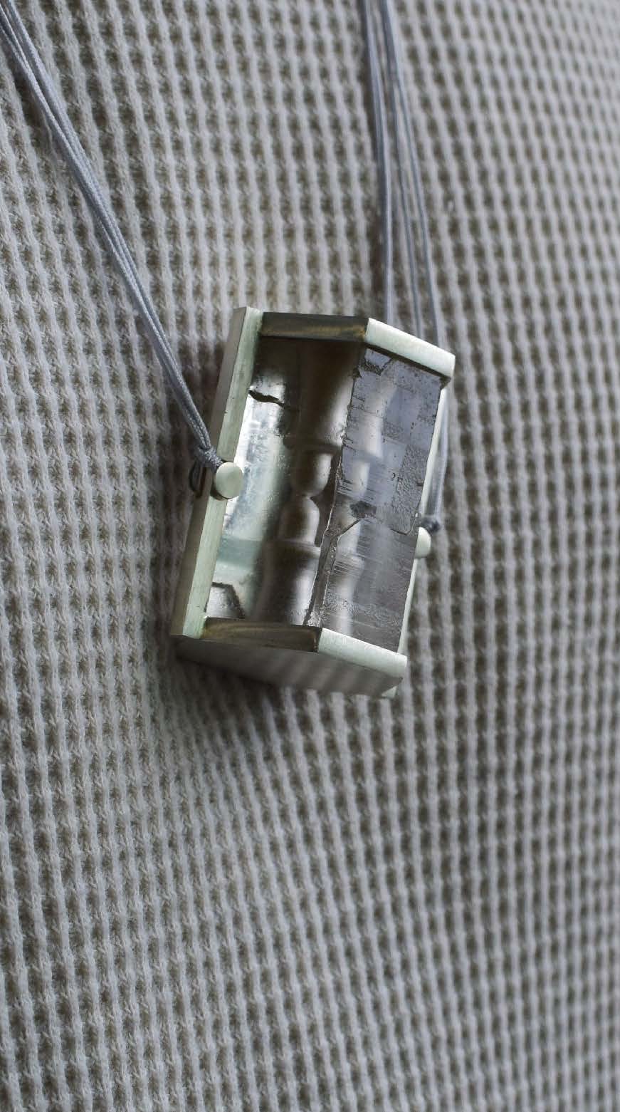
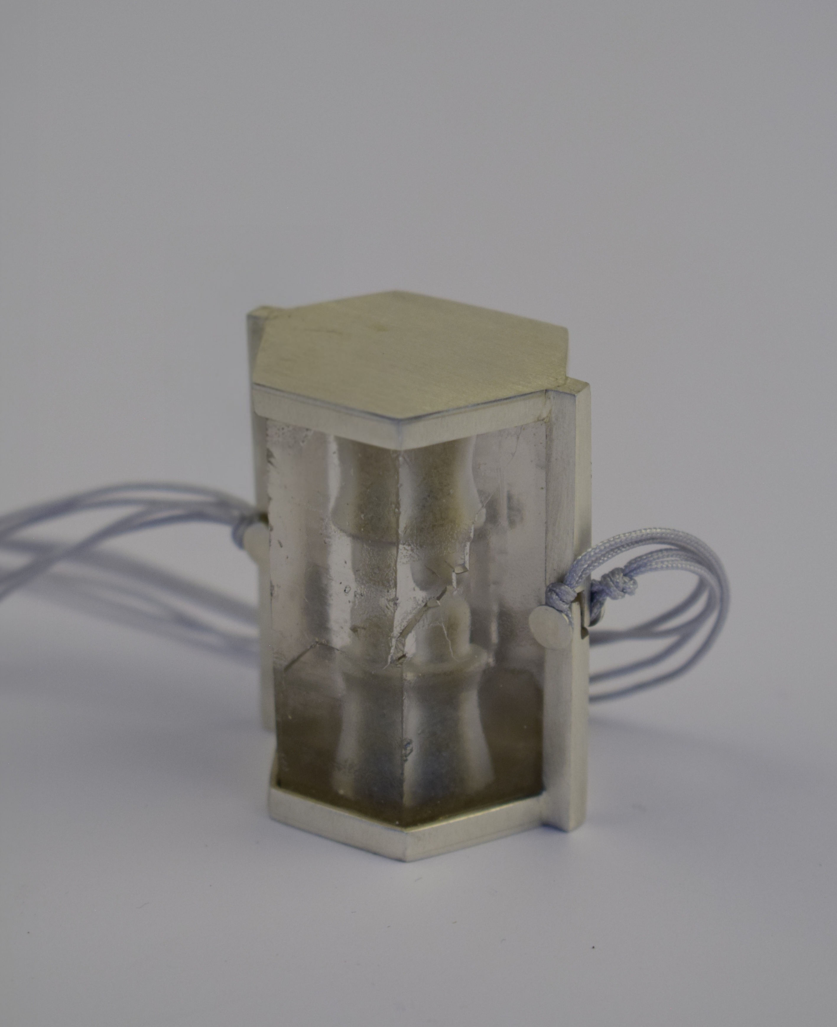
We do not remain unchanged.
We remain different.
Silver, rock crystal, amber, macramé cord
The rock crystal, which I cut myself, is polished on the outside and engraved on the inside with two symbolic figures. One of these is filled with silver dust, the other with amber. A small hole connects the two and allows them to be exchanged.
The necklace can be worn in different lengths and twisted around itself.
This work is intended to show how love and relationships can change us as human beings.
More
I wish you were mine
I wish I were yours
I wish to be yours
and have you as mine
because I want you inside me
and me inside you
and to share everything
What is mine shall be yours
Sharing everything and love
Shared, doubled, and finally understood
That it is you I cannot do without
Jonathan Wilhelm (Germany)
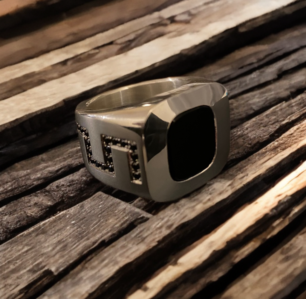
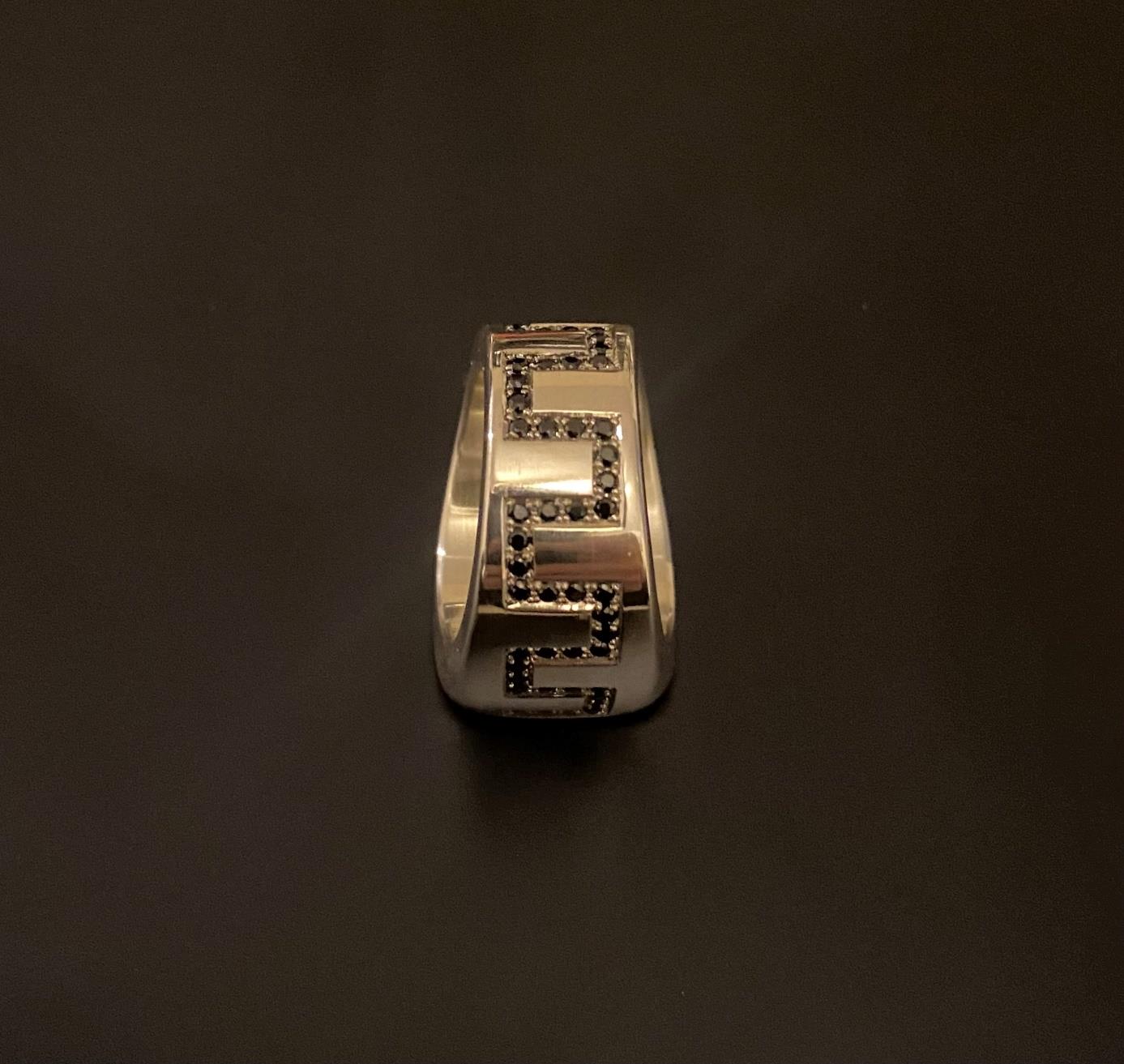
Since childhood, I have developed a wide range of interests. I have always been particularly fascinated by large buildings, gardens, cars of all kinds, and much more. These three main interests have one clear thing in common: architecture. It brings life and dynamism to all areas.
The Bauhaus style is my preferred art, design, and architecture style. This style, which emerged in the 20th century, is characterized by functionality, clean lines, and geometric shapes—elements that are also reflected in my personal interests.
More
Three years ago, I began my training as a gemstone setter. The decision to pursue this craft was an easy one, as it allowed me to combine my creative interests. Gemstones hold a special fascination for me—not only because of their beauty, but also because of the possibilities they offer for integration into unique pieces of jewelry.
My desire was not only to set pre-selected stones, but to design and create my own pieces of jewelry. One of my first personal projects was a layered stone ring, which is meant to symbolize strength, self-confidence, and inner peace.
My enthusiasm for cars—especially their design and form—has also influenced my jewelry design. I was particularly inspired by the Mercedes-Benz G-Class. The striking, solid exterior walls, the clean lines, and the slight slope of the side walls, which taper toward the top, appealed to me aesthetically.
Upon closer inspection of my layered stone ring, you can see that the rough outer contour of the vehicle—especially from the middle onwards—is reflected in the design of the ring. The onyx layered stone symbolically corresponds to the roof of the vehicle. The transitions, edges, and surfaces of my ring deliberately echo the characteristic shapes of the G-Class.
I also made a few design adjustments: the slope of the ring band was flattened toward the center, as was the bezel around the center stone. The development can be seen in the drawing below.
Lebohang Dlamini (Südafrika)
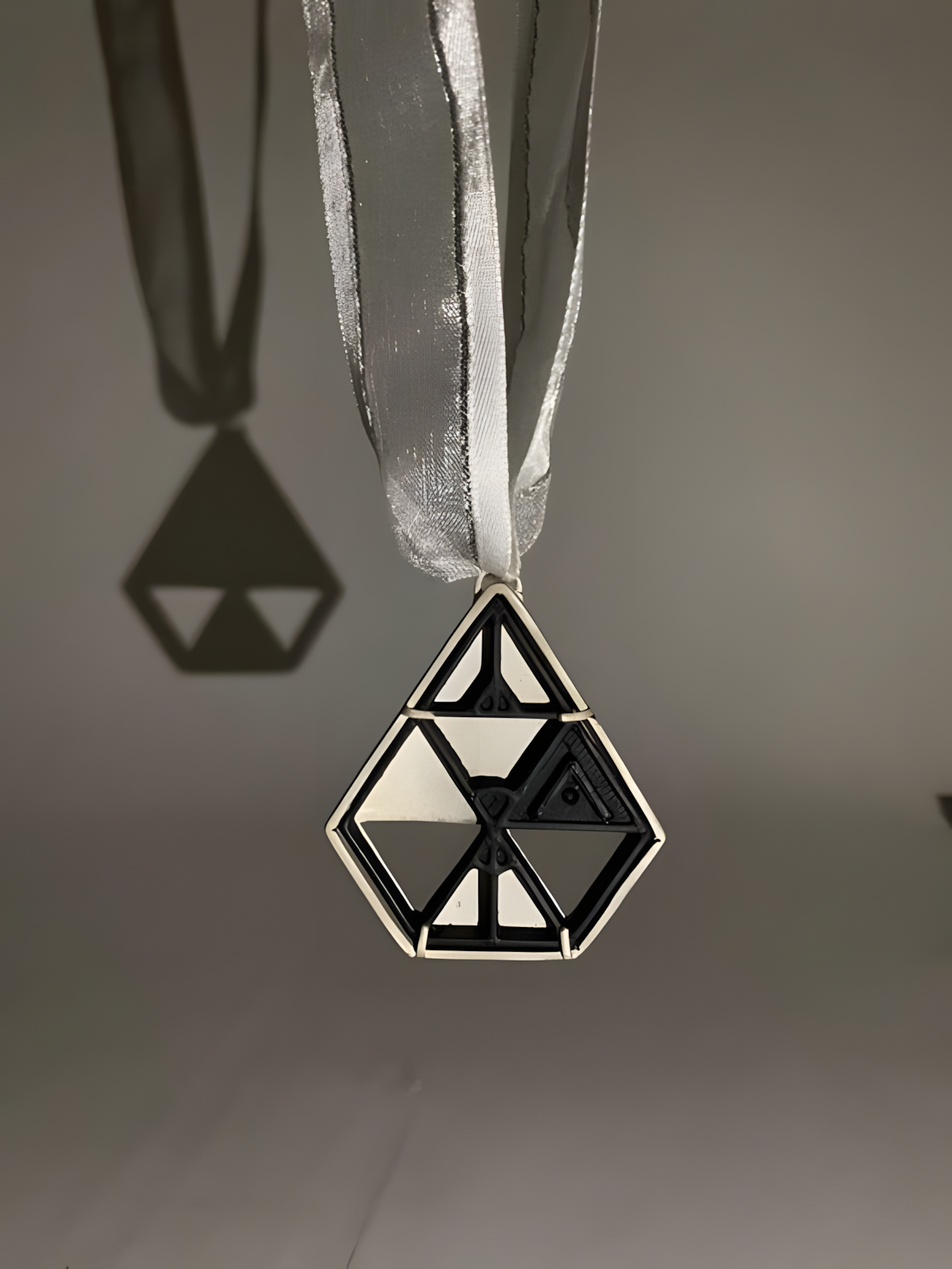
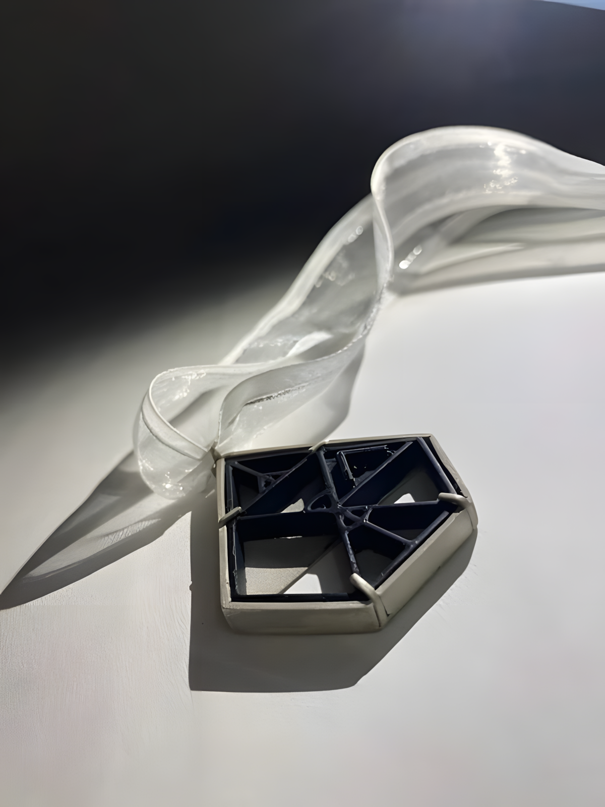
As part of our assignments in our first year of the Diploma in Jewellery Design we were tasked to design a 20-year commemorative medal for the University of Johannesburg, the designs were to be made up of only symbols from an African writing system called “Isibeqhe”. The Isibeqhe writing system makes use of syllables where each syllable represents a symbol and when multiple symbols are put together it creates a word. The word that I have chosen to create in my design in “Ukuzingisa” a Xhosa word in the South African language which can be translated into “Perseverance”. Ukuzingisa is then broken down into five syllables like so; U-ku-zi-ngi-sa. Those syllables are then turned into five triangular symbols which are incorporated into my design as seen with the example below.
More
The word Ukuzingisa is rearranged in a manner where it creates a suitable geometric shape for a medal. The medal is essentially made up of two main components, a resin cast which acts as a stone in this situation and metal frame that surrounds the resin cast acting as a setting if you were to think of it as a pendent. The resin cast is designed on CAD (Computer Aided Design) which is then sent for 3D printing and then for resin casting. A setting is then manufactured around the resin cast, with the setting being made of silver metal. The setting features four claws soldered to the bottom and near the top to hold the resin cast securely and in place. The top of the setting features an o-link soldered to it as well as a V-loop for the ribbon/neck strap to go through.
The resin cast is not completely solid and features negatives spaces. This allows for portions of the silver metal to be visible when looking at the medal from the front. This can be seen in the example drawing above where the darker shaded areas represent the metal that is visible. The setting its self also has negative space with two upsides down triangles pierced out this again can be seen as the pure white triangles on the example triangle. The use of negative space through out the medal is designed to create a sense of depth. The overall design and manufacture of the medal is structured in a way to represent techniques that are associated with fine jewellery as well as contemporary jewellery where there is freedom to be experimental hence the use of resin casting which gives the medal a balanced feel of luxury and artistry.